You walk into your living room and something feels off. The square footage looks fine on paper, but the space feels cramped, tight, and uncomfortable. Most people blame the size of the room. But in reality, the problem is almost always the layout.
Room layout mistakes are surprisingly common, and they can shrink the visual perception of any room by 20% to 40%. The good news is that every one of these mistakes has a practical fix. You do not need to knock down walls or renovate your entire home. Sometimes, all it takes is moving a sofa, swapping a rug, or rethinking how your furniture sits in the room.
This guide breaks down the most damaging room layout mistakes that make spaces feel smaller than they are, explains why each one happens, and walks you through exactly how to fix them. Whether you are working with a small apartment, a compact bedroom, or a living room that never quite feels right, these solutions will help you unlock space you did not know you had.
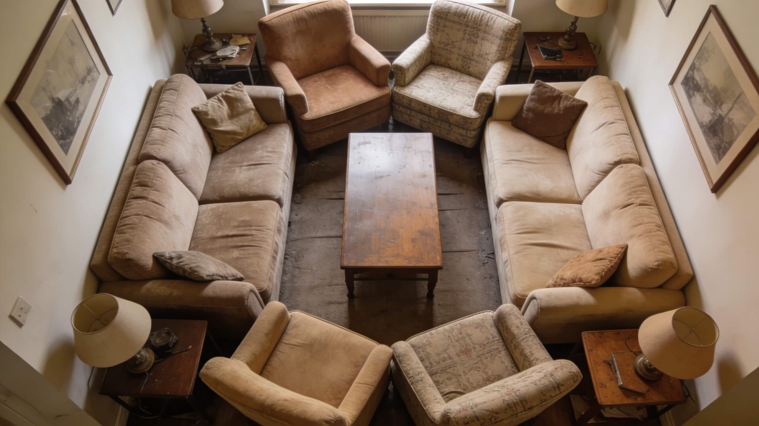
1. Pushing all furniture against the walls
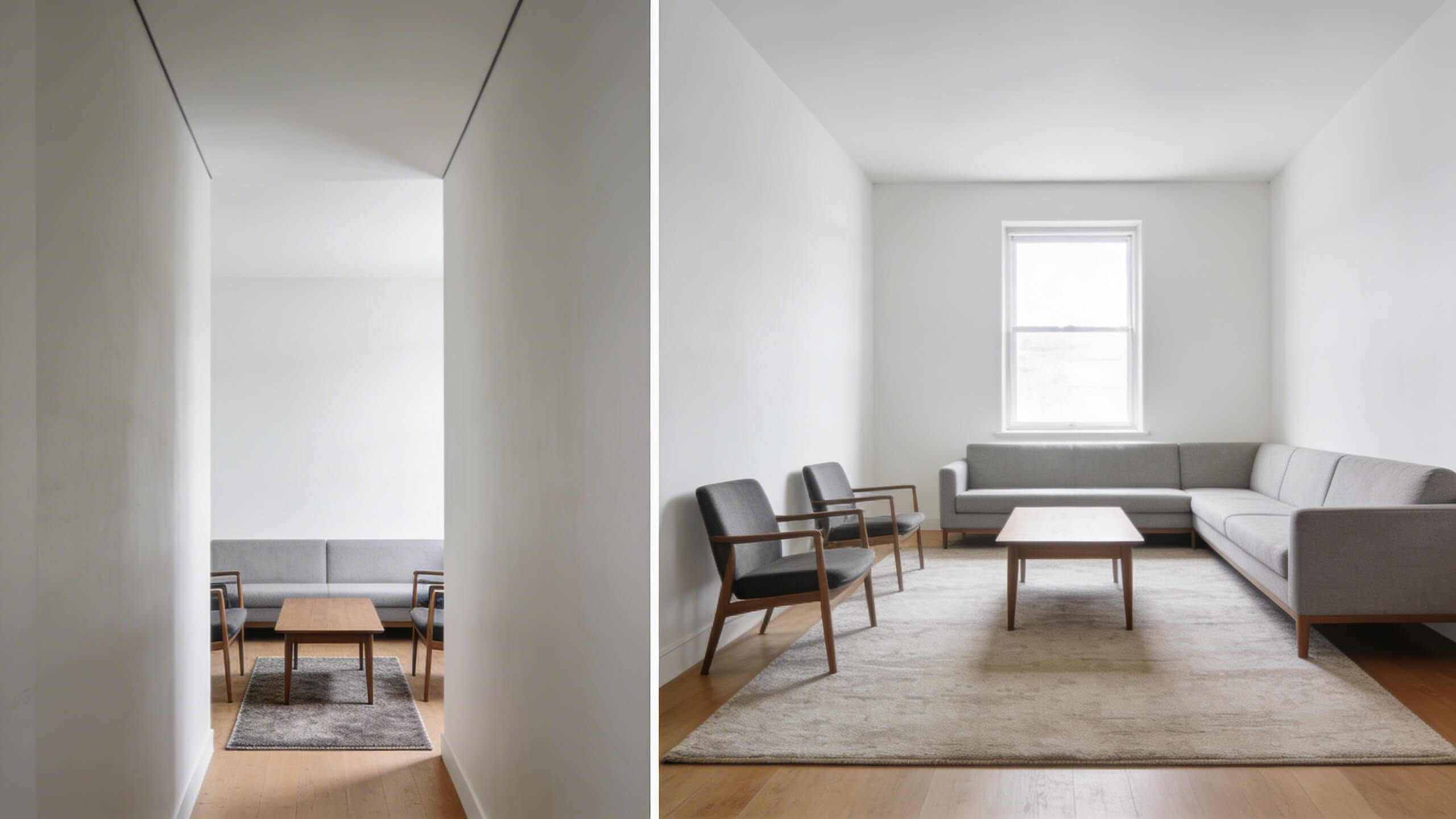
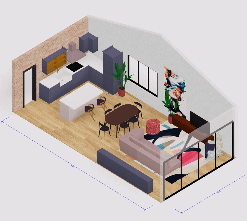
This is the most widespread layout mistake homeowners make. It feels logical: push everything to the edges, and the open center should make the room feel bigger. But the opposite happens. When every sofa, chair, and side table lines the perimeter, the room traces its own walls and highlights exactly how small it is. You end up with a hollow, disconnected center and a space that feels more like a waiting room than a living area.
The fix is straightforward. Pull your main seating piece at least 6 to 12 inches away from the wall. In larger rooms, float the sofa entirely and create a conversation grouping in the center. This creates layers of depth. The shadow behind the furniture gives the illusion that the room extends further than it does. Angle chairs toward each other rather than lining them up in a row. Even in tight spaces, a few inches of breathing room between the wall and the furniture makes a noticeable difference.
If you are unsure how your furniture will look away from the walls, try planning it digitally first. Using our room designer online tool lets you drag and drop furniture into a virtual version of your room, test different placements, and see the result before moving a single piece.
2. Choosing the wrong rug size
A rug that is too small for the room is one of the fastest ways to make a space look cramped. When a small rug floats in the center of your seating area without connecting to any of the furniture around it, it chops the floor into disconnected sections. Your eye reads each section as its own tiny zone, and the overall room feels fragmented.
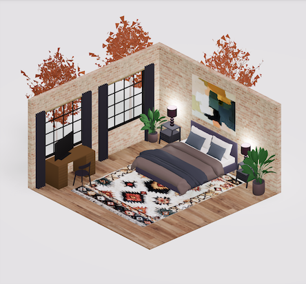
The rule is simple: your area rug should be large enough so that at least the front legs of all major seating pieces rest on it. Ideally, leave about 12 to 18 inches of bare floor between the rug edges and the walls. This creates one unified visual zone instead of multiple competing patches of floor. In bedrooms, the rug should extend at least 18 to 24 inches beyond the sides and foot of the bed so you step onto softness each morning.
If you are shopping for a rug and feel torn about sizing, always go larger. A generously sized rug anchors the furniture grouping, pulls the layout together, and makes the entire floor feel more expansive.
3. Using oversized or poorly scaled furniture
That deep sectional looked perfect in the showroom. But once it arrived at your home, it swallowed the entire living room. Scale mismatch is a silent space killer. Oversized furniture dominates the room, blocks walking paths, and leaves little room for anything else.
On the other hand, furniture that is too small and delicate can make the room feel empty and underfurnished, which also creates a sense of imbalance. The solution is proportional planning. Your main sofa should occupy roughly two-thirds of the wall behind it. The coffee table should be about half to two-thirds the length of the sofa.
Leave at least 30 to 36 inches for main walkways and 18 inches of clearance around dining tables. Choose furniture with clean lines, visible legs, and slimmer profiles for smaller rooms. Pieces that reveal floor space beneath them create an airier feel than bulky, floor-hugging designs.
Before purchasing any furniture, measure your room and map out the layout. 3D planning tools help you visualize whether that sectional will actually fit or if a loveseat and two armchairs might work better for the space.
4. Ignoring traffic flow and walkways
A beautifully furnished room means nothing if you have to squeeze sideways between the sofa and the coffee table every time you stand up. Blocked traffic paths create physical discomfort and make the room feel congested, even when there is technically enough square footage.
Map out the natural paths people take through the room. The route from the doorway to the seating area, from the kitchen to the dining table, and from the hallway to the bedroom should all be unobstructed. Aim for 30 to 36 inches of clearance for primary walkways and at least 24 inches for secondary paths between furniture pieces. Avoid placing coffee tables or ottomans in direct walking lines.
Good traffic flow also means thinking about sight lines. When you can see from one area of the room to another without visual obstructions, the space instantly feels more open and connected. Remove any furniture that blocks the natural line of sight from the entrance to the window or focal point.
5. Relying on a single overhead light
One ceiling fixture lighting an entire room is a recipe fora flat, shadowless space that feels smaller than it is. Overhead lights alone create harsh downward shadows and leave the corners of the room dark. The result is a space that looks compressed and uninviting, especially in the evening.
The fix is layered lighting. Combine ambient light (a central fixture or recessed cans) with task lighting (table lamps, reading lights) and accent lighting (wall sconces, LED strips). Placing lamps at different heights creates depth and draws the eye outward toward the edges of the room. When the perimeter of a room is lit, it visually expands the space. Warm white bulbs around 2700K create a cozy atmosphere without the harshness that higher temperatures produce.
Add dimmer switches wherever possible. The ability to adjust light intensity lets you control how the room feels at different times of day and prevents the flat, overlit look that shrinks a room visually.
6. Too much visual clutter on every surface
When every shelf, tabletop, and corner holds decorative objects, your brain works overtime processing the visual information. This sensory overload translates directly into a feeling of being spatially confined. A room packed with accessories, books, souvenirs, and random objects feels chaotic and smaller than it is, even when there is plenty of physical space.
Edit your surfaces with intention. Group decorative items in odd numbers (threes work best) and vary the heights to create visual interest without chaos. Leave open space on shelves and tabletops so the eye has somewhere to rest. Negative space is not wasted space; it acts as a visual breathing room that makes the entire room feel calmer and larger.
Invest in closed storage solutions like ottomans with hidden compartments, lidded baskets, and cabinets with doors. When everyday clutter like remotes, cables, and blankets has a designated home, the room reads as clean and spacious rather than busy and cramped.
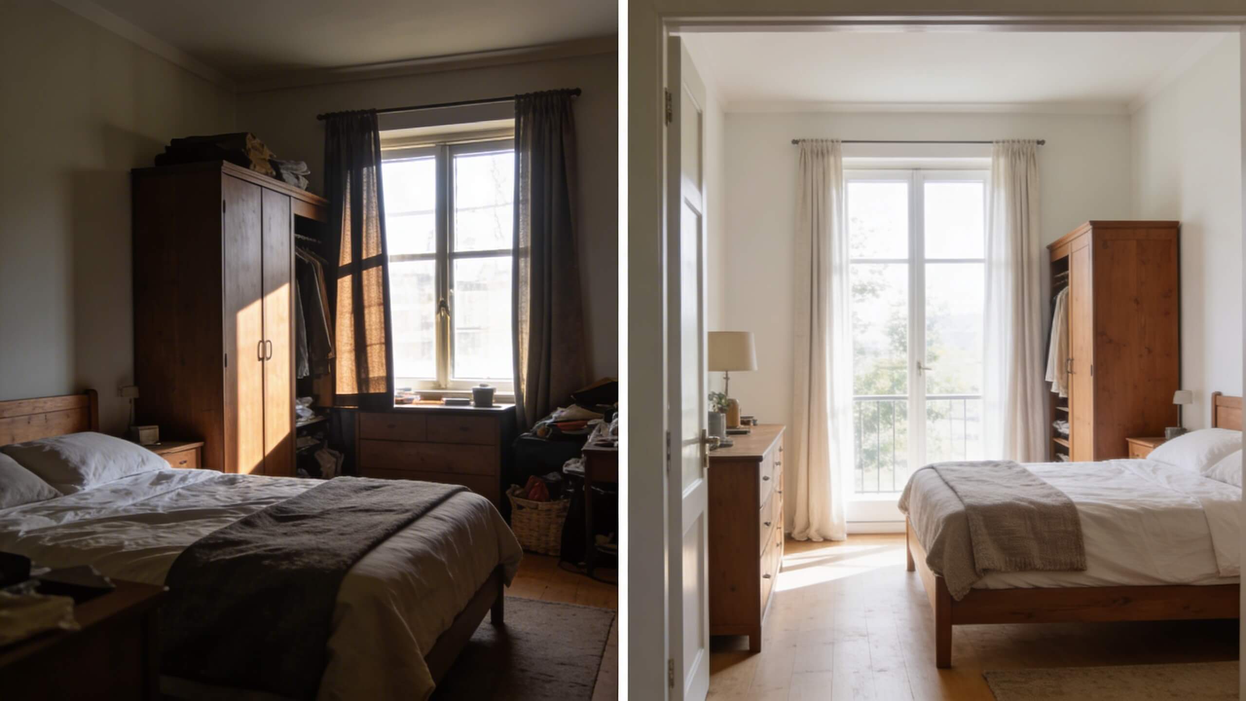
7. Blocking natural light with furniture or heavy Window Treatments
Natural light is one of the most powerful tools for making a room feel larger. When you place tall furniture in front of windows or hang dark, heavy curtains that block daylight, you cut off the room from its best asset. A dimly lit room always feels smaller than a bright one, regardless of actual dimensions.
Position your tallest furniture pieces on walls that do not have windows. Keep the areas around windows clear and let daylight flood in. Replace heavy drapes with lighter fabrics or sheer curtains that filter light without blocking it. Hang curtain rods higher than the window frame and wider than the window itself. This creates the illusion of taller, wider windows and makes the entire wall feel more expansive.
If your room lacks natural light, use mirrors strategically. Place a large mirror opposite a window to bounce light deeper into the room. This doubles the visual effect of whatever daylight you do have and creates the perception of additional depth.
8. Neglecting vertical space
Rooms feel smaller when everything sits at one height level. If all your furniture, shelving, and decor hover at the same midpoint, the eye has no reason to travel upward. This compresses the perceived height of the room and makes the ceiling feel lower than it is.
Use vertical space intentionally. Install shelves that extend upward toward the ceiling rather than stopping at eye level. Hang artwork higher (the center of the piece should sit at about 57 to 60 inches from the floor). Choose floor to ceiling curtains even if the window is shorter. Tall, narrow bookcases and vertical storage solutions draw the eye upward and emphasize the full height of the room.
In rooms with lower ceilings, paint the ceiling a shade lighter than the walls. This simple trick makes the ceiling visually recede and adds perceived height to the space.
9. Using dark colors without enough light to support them
Dark paint colors absorb light instead of reflecting it, which can make a room feel enclosed if the lighting is not adequate. This does not mean you should avoid dark colors entirely. A rich navy or charcoal accent wall can actually add depth and drama to a room. The mistake is using dark tones on every wall without sufficient natural or artificial light to balance them.
If you want darker walls, pair them with lighter flooring, furniture, and textiles to create contrast. Make sure the room has enough layered lighting to compensate for the light absorption. In small rooms with limited windows, lighter wall colors like soft whites, warm grays, and pale neutrals reflect more light and make the walls feel like they are receding, which visually expands the space.
A tested approach is to choose your furniture and rug first, then select a wall color that complements them. This prevents you from painting the room a dramatic shade and then struggling to furnish around it.
10. Not planning the layout before arranging furniture
The biggest underlying mistake behind all the issues above is skipping the planning step entirely. Most people arrange furniture by guesswork. They push pieces around until something seems to work, and then they live with a layout that was never truly designed for the room. This reactive approach leads to poor flow, awkward spacing, and spaces that never feel quite right.
The fix is to plan before you place. Measure your room dimensions. Note the location of doors, windows, outlets, and any fixed features like fireplaces or built in shelving. Then map out your furniture on paper or, better yet, in a 3D tool that lets you see the layout from multiple angles.
Arcadium 3D is a browser-based 3D design platform that lets you build your floor plan, add furniture, and visualize your space from any perspective without downloading any software. You can test different layouts in minutes, share your design via URL with anyone who needs to see it, and avoid the costly trial and error of physically moving heavy furniture around your room.
Frequently asked questions
What is the number one room layout mistake that makes a space feel smaller?
Pushing all furniture against the walls. It traces the room's perimeter and highlights its exact dimensions instead of creating visual depth.
How far should furniture be from the wall to make a room look bigger?
Even 6 to 12 inches of space between furniture and the wall creates a shadow effect that adds perceived depth. In larger rooms, floating key pieces work entirely better.
Does rug size really affect how big a room feels?
Yes. A rug that is too small fragments the floor into disconnected zones, making the room feel choppy. A properly sized rug unifies the seating area and makes the floor look more expansive.
Can dark wall colors work in a small room?
They can, but only with enough lighting to compensate. Pair dark walls with lighter furniture, reflective surfaces, and layered lighting. Without adequate light, dark colors absorb too much and make the room feel enclosed.
How much walkway space should I leave between furniture?
Aim for 30 to 36 inches for primary walking paths and at least 24 inches between furniture pieces in secondary areas. Anything less creates a congested feeling.
How can I plan my room layout without moving furniture around?
Use a 3D room design tool like Arcadium 3D. It lets you build a virtual floor plan, drop in furniture, and test layouts from every angle before physically rearranging anything.
Does lighting really make a room feel bigger?
Absolutely. Layered lighting that illuminates corners and the perimeter of a room visually expands the space. A single overhead light flattens everything and makes the room look compressed.


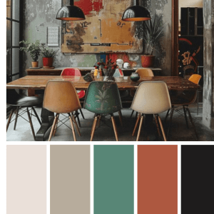 Color palette generator
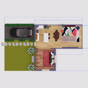 Floor plan creator
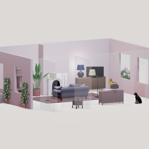 Interior design app
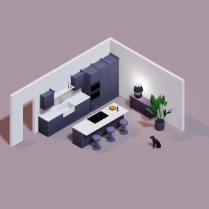 Kitchen design tool
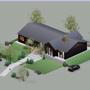 House design software
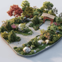
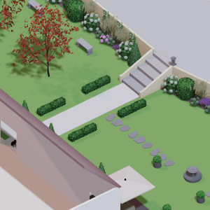 Landscape design software
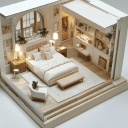
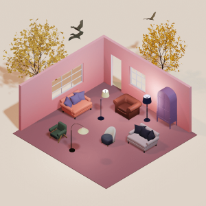 Bedroom design
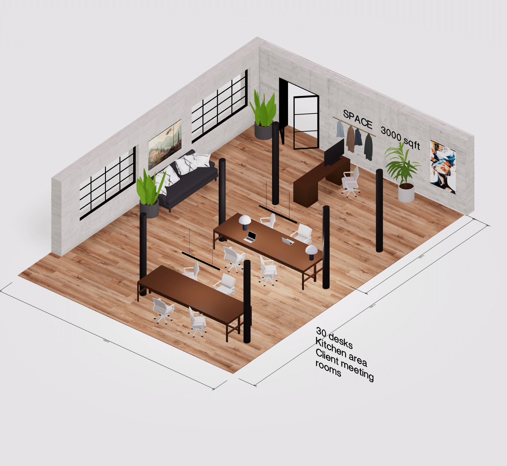 Office floor plan creator
 How to use Arcadium — full guide
 3D object library - free
 Articles and blog