Color theory is the set of rules that explains how colors relate, mix, and work together in a design. It uses the color wheel to map those relationships, which helps you build palettes that look balanced instead of random.
Designers rely on it to choose colors with intent, not guesswork. Getting color right carries real weight. Research from the University of Loyola, Maryland, found that color raises brand recognition by up to 80%.
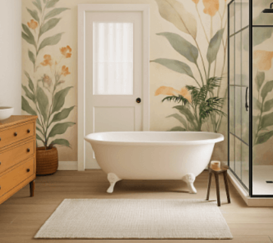
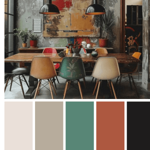
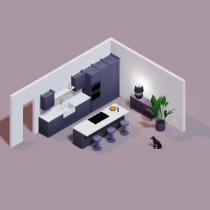
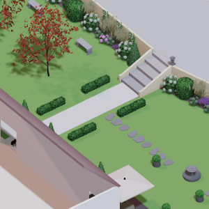
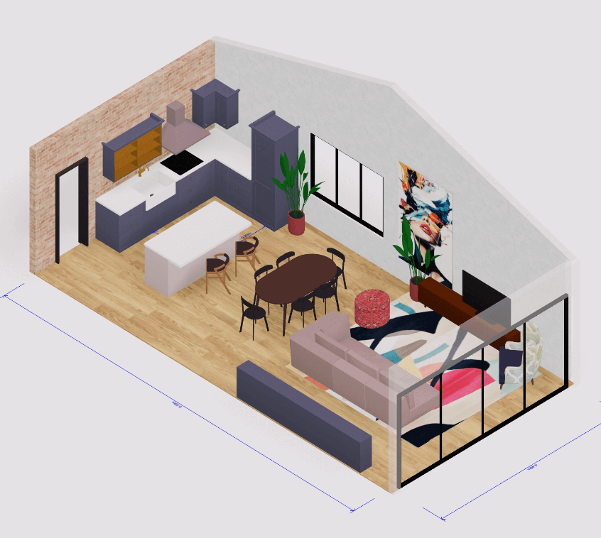
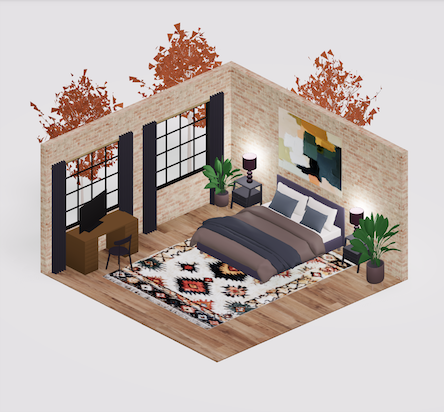
At Arcadium 3D, we see the same pattern in product mockups, where a clear palette makes a scene read as polished and intentional. This guide breaks down the wheel, the main schemes, and how to apply them to your own work.
What is color theory?
Color theory is a practical framework for combining colors so they look good together. It blends a bit of art and a bit of science to predict which combinations feel harmonious and which clash.
The idea goes back centuries, but the modern version centers on the color wheel. Isaac Newton mapped the color spectrum onto a circle in 1666, and that circle still anchors how designers think today. Artists use it to mix paint, and digital designers use it to build screens.
Three terms describe any single color. Hue is the color itself, like red or blue. Saturation is how intense or pure that color looks. Value is how light or dark it is.
Mixing white, black, or gray with a hue creates new versions of it. A tint adds white, a shade adds black, and a tone adds gray. These variations give you depth without leaving your core palette.
The color wheel explained
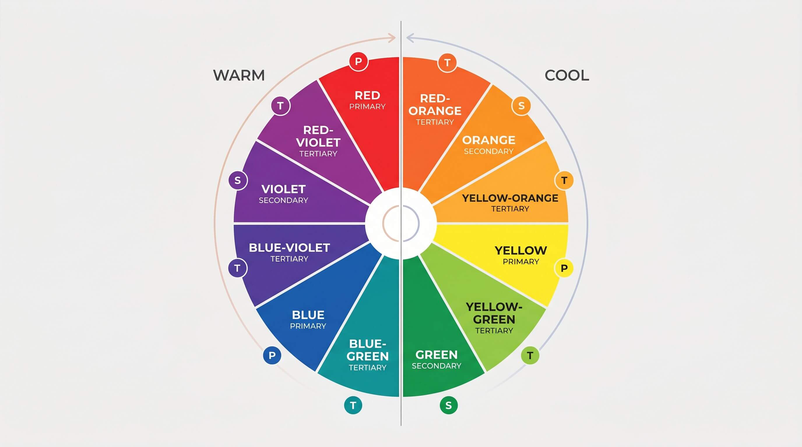
The color wheel organizes hues into three groups based on how they are made. Primary colors come first, then secondary, then tertiary.
Primary colors cannot be mixed from other colors. In traditional art theory, they are red, yellow, and blue. Every other color on the wheel traces back to these three.
Secondary colors form when you mix two primaries. Red and yellow make orange, yellow and blue make green, and blue and red make purple. Each secondary sits between its two parent hues on the wheel.
Tertiary colors come from mixing a primary with a neighboring secondary. Blue-green and red-orange are two examples. These six hues fill the gaps and give you finer control over a palette.
The wheel also splits into warm and cool sides. Warm colors like red, orange, and yellow feel active and energetic. Cool colors like blue, green, and violet feel calm and steady. This temperature split is a fast way to set the mood of a design before you pick exact shades.
One note on models. Artists work in RYB (red, yellow, blue), screens use RGB (red, green, blue), and print uses CMYK. The wheel logic stays the same across all three, even though the primaries differ.
The main types of color schemes
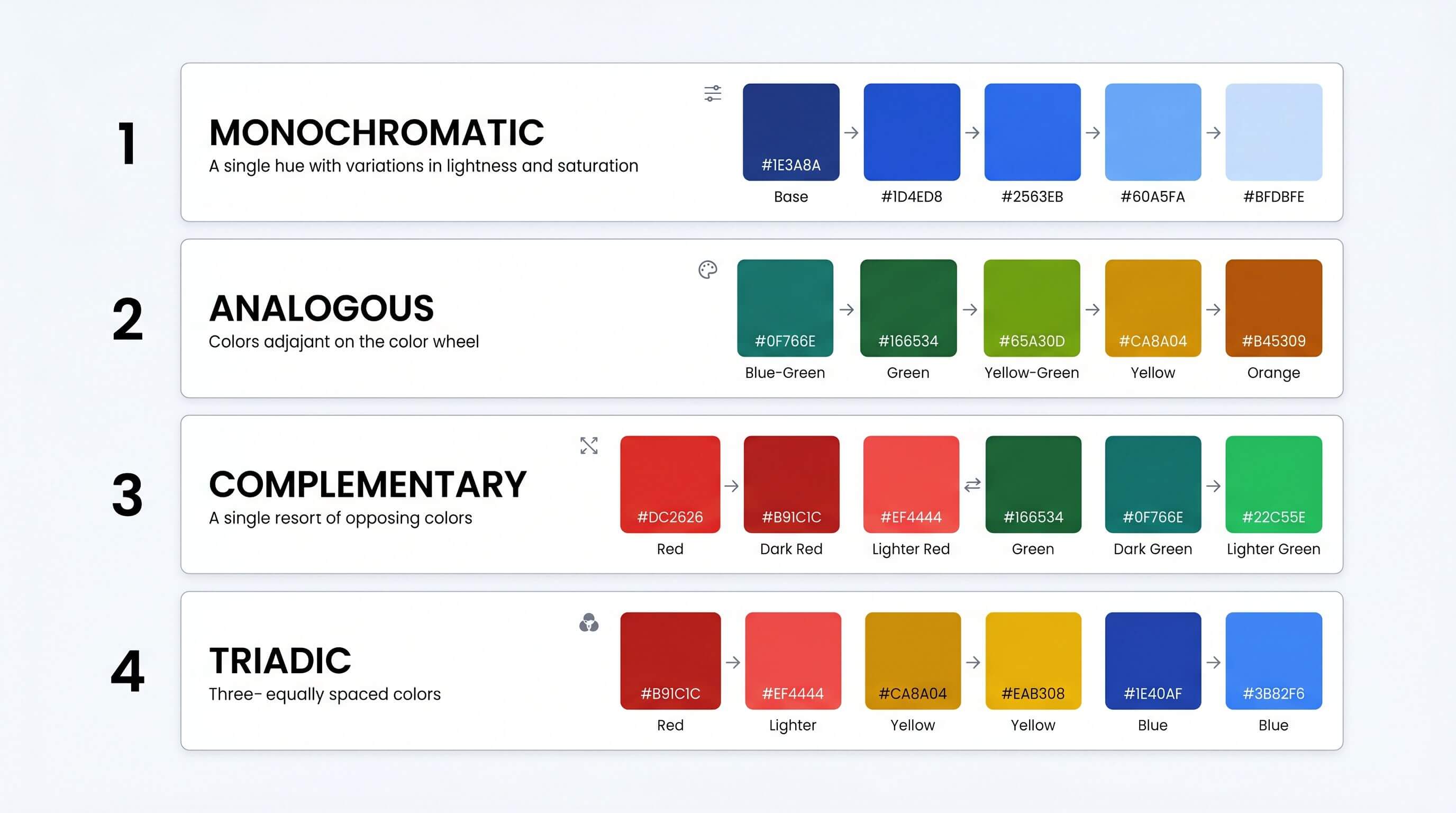
A color scheme is a set of colors chosen by their position on the wheel. Picking a scheme gives your palette structure instead of a pile of colors that happen to be nearby. Designers call a pleasing combination a color harmony.
Here are the schemes you will use most:
Beginners do well to start monochromatic. A single hue is the hardest scheme to get wrong, since every color already shares a common base. Complementary pairs deliver the most contrast, which makes them strong for buttons and anything you want noticed.
One word of caution on complementary colors. Two pure, fully saturated opposites can appear to vibrate along their shared edge and strain the eye. Soften one of them with a tint or shade, and the pairing calms down.
How to build a palette with the 60-30-10 rule
The 60-30-10 rule is the simplest way to turn a scheme into a working palette. Use 60% of your design for a dominant color, 30% for a secondary color, and 10% for an accent. The accent carries your most important element, usually a call to action.
This split prevents a colorful mess. The dominant color sets the base, the secondary adds interest, and the accent points the eye where you want it. The Nielsen Norman Group recommends keeping the dominant and secondary colors fairly neutral so the accent can stand out.
Here is how that plays out with real numbers. Picture an e-commerce mockup with a navy dominant, a light-gray secondary, and one accent color for the buy button. Switching that accent to orange can raise clicks, since orange call-to-action buttons converted about 2.4% higher than green in recent e-commerce tests. The layout still feels balanced because the accent covers only 10% of the screen.
You can preview these splits before committing. Our Arcadium 3D color picker tool lets you test a dominant, secondary, and accent together in seconds, so you see the ratio at work instead of guessing.
Color theory and accessibility
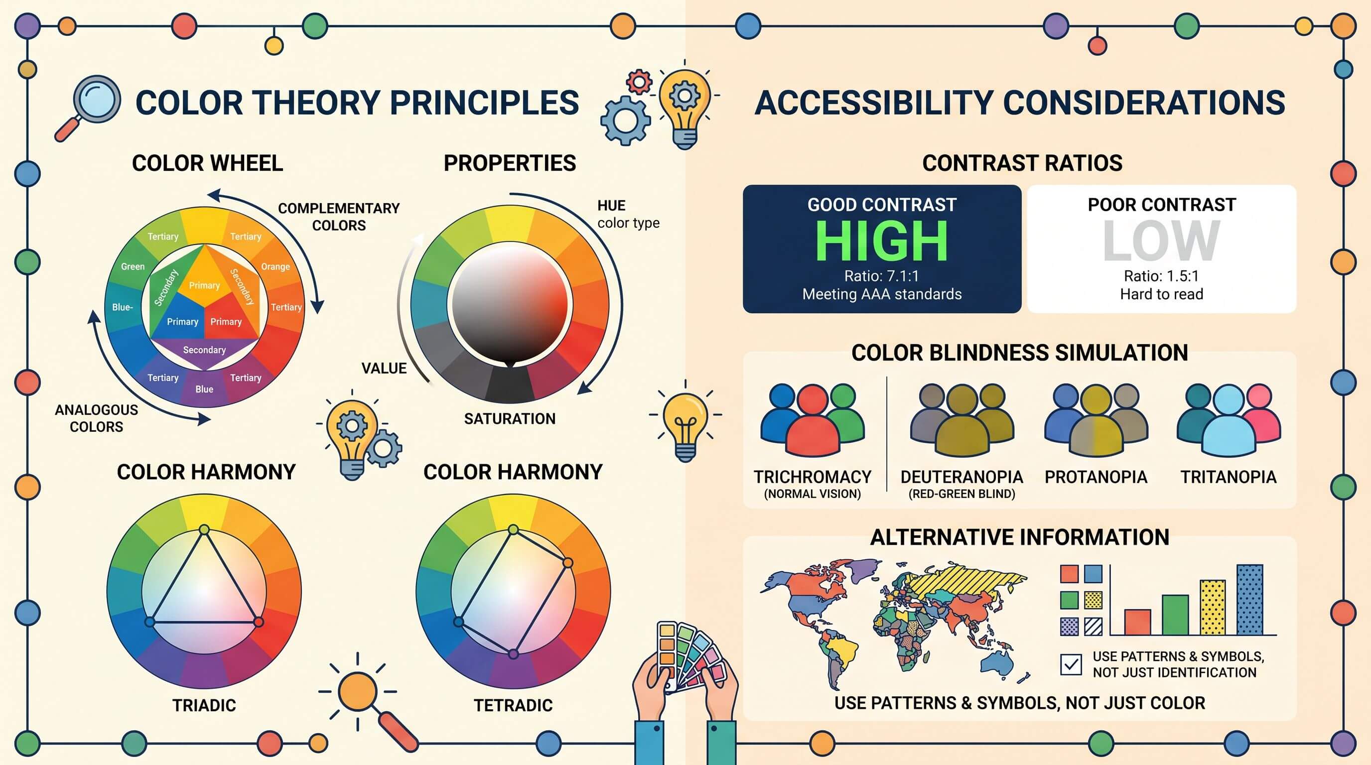
A palette is not finished until it passes a contrast check. A design can follow every harmony rule and still fail people who cannot tell two close colors apart. Roughly 1 in 12 men has some form of color blindness, so contrast does real, practical work.
Use the WCAG contrast standard as your floor. Normal text needs a contrast ratio of at least 4.5 to 1 against its background, and large text needs at least 3 to 1. WebAIM found that 86.4% of homepages failed these checks, which shows how easy the mistake is to make.
Test your colors before you ship anything. A free contrast checker flags weak pairings in seconds and saves you from rebuilding later. Strong contrast keeps your work readable in bright light, on cheap screens, and for every visitor.
Frequently asked questions
What are the 3 basic color schemes?
The three most common schemes are monochromatic, complementary, and analogous. Monochromatic uses one hue with different tints and shades. Complementary pairs two colors that sit opposite each other on the wheel for high contrast. Analogous uses colors that sit next to each other for a calm, unified look. Beginners often start with monochromatic because it is the hardest to get wrong.
What is the 60-30-10 rule in color theory?
The 60-30-10 rule splits a palette into three proportions. Sixty percent goes to a dominant color, thirty percent to a secondary color, and ten percent to an accent. The dominant color sets the base, the secondary adds interest, and the accent draws the eye to key elements like buttons. The rule keeps a design balanced and stops any single color from taking over.
What is the difference between complementary and analogous colors?
Complementary colors sit directly opposite each other on the wheel, like blue and orange. They create strong contrast and feel bold. Analogous colors sit next to each other, like blue, blue-green, and green. They share a common hue, so they blend smoothly and feel calm. Use complementary pairs for emphasis and analogous groups for a relaxed, cohesive mood.
Which colors go well together?
Colors based on a wheel relationship tend to work together. Opposites create contrast, neighbors create harmony, and three evenly spaced colors create a balanced, vibrant set. A reliable habit is to balance warm and cool tones and keep a clear hierarchy of one dominant color. Testing the combination in a real layout, not just on the wheel, confirms whether it holds up.
What is color harmony?
Color harmony describes a set of colors that look pleasing and orderly together. Schemes built on complementary, analogous, or triadic relationships usually read as harmonious. Harmony depends partly on personal and cultural response, so there is no single correct answer for every audience. The practical goal is a palette that feels intentional and supports the message rather than competing with it.
Conclusion
Color theory gives you a repeatable system instead of trial and error. Learn the wheel, pick a scheme, apply the 60-30-10 rule, and check your contrast. Those four steps cover almost every palette decision you will face.
The fastest way to learn is to build a palette and see it in context. Try our Arcadium 3D color picker tool to test your dominant, secondary, and accent colors together, then drop them straight into your next design.


 Color palette generator
 Floor plan creator
 Interior design app
 Kitchen design tool
 House design software
 Landscape design software
 Bedroom design
 Office floor plan creator
 How to use Arcadium — full guide
 3D object library - free
 Articles and blog