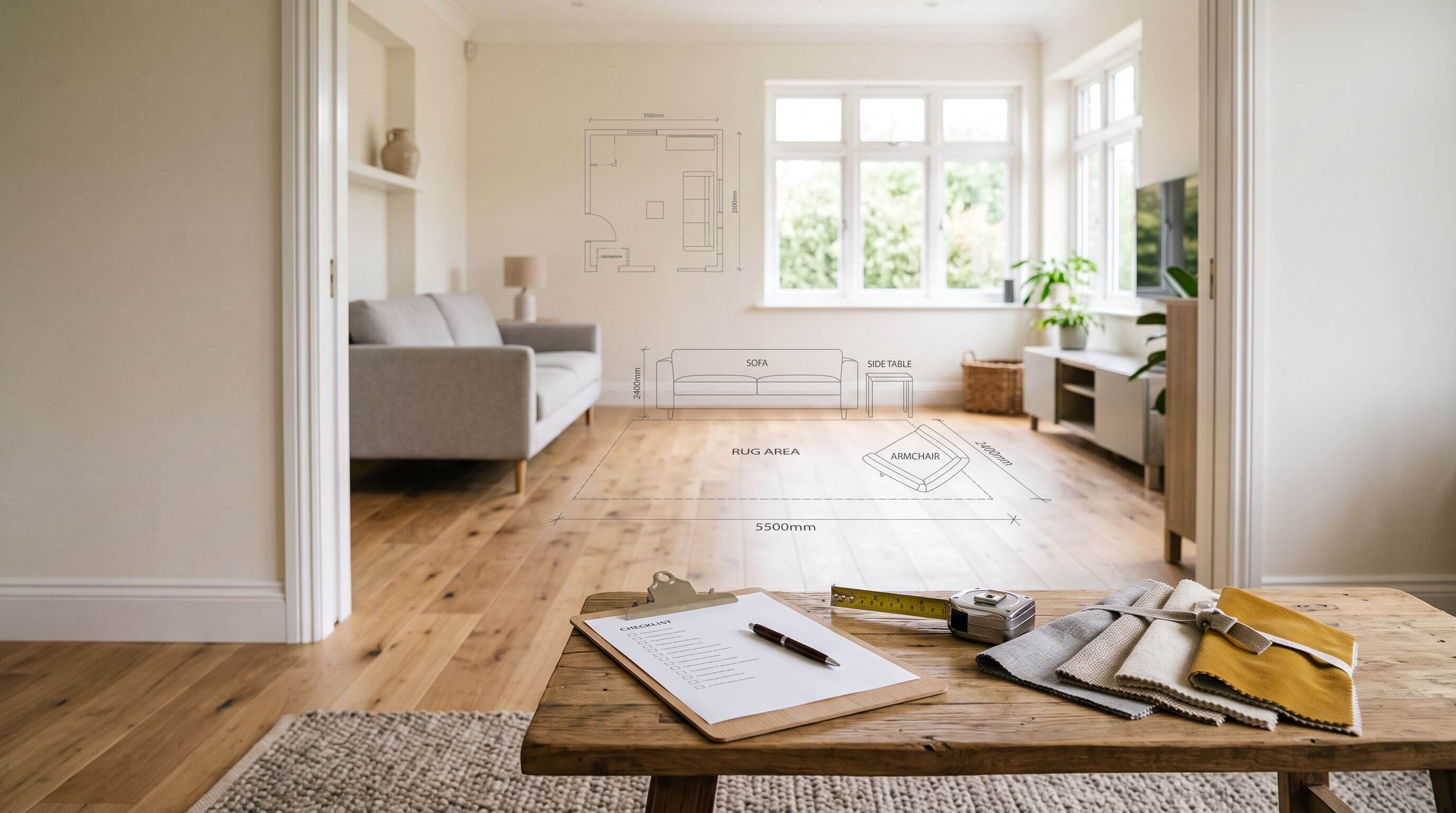
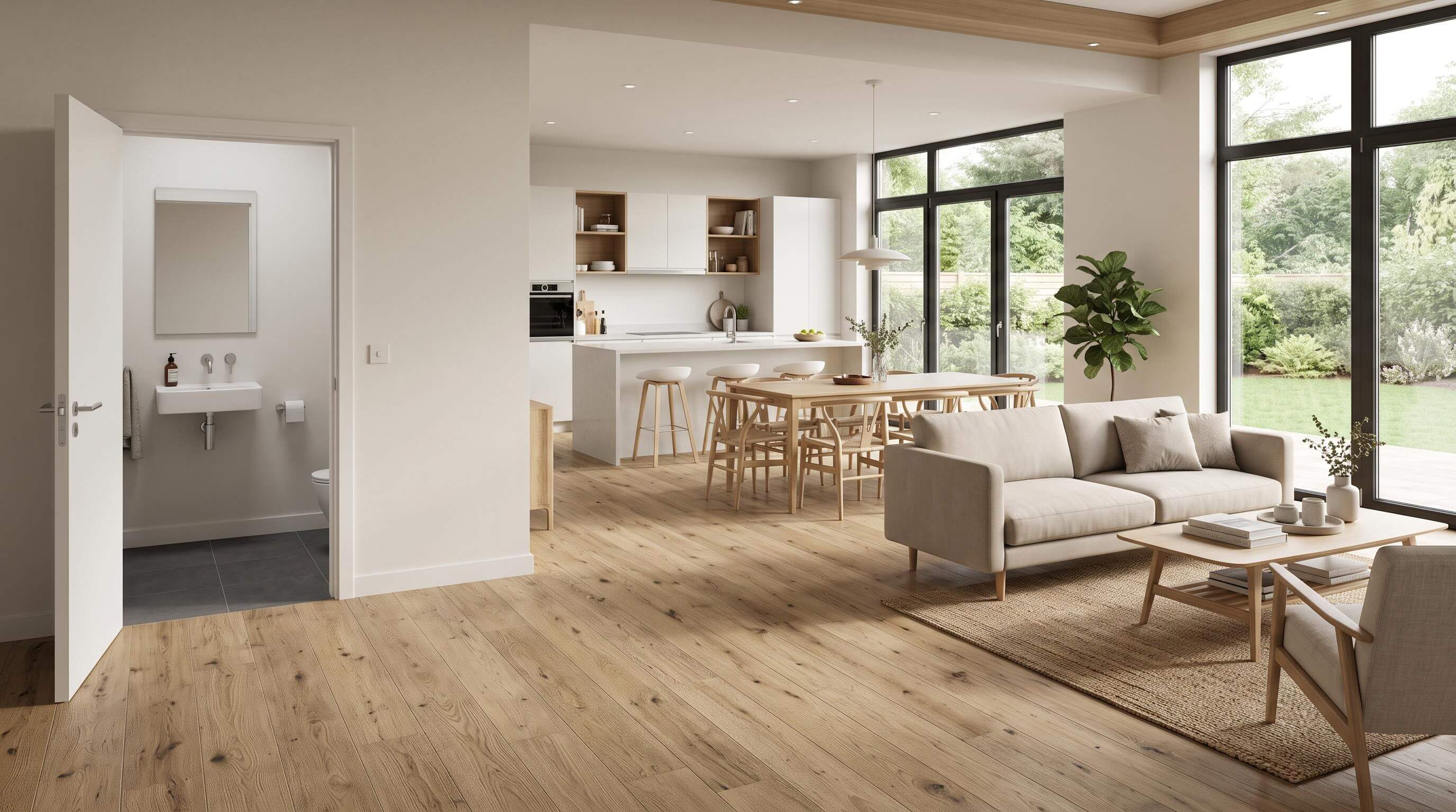
To choose a paint colour for a room, start with what you can't change (floor, worktops, large furniture), check which way the windows face and what bulbs you use, then shortlist colours by undertone and LRV. Preview the scheme in 3D and test two or three large samples on the walls for 48 hours before buying.
Every rule below uses a number you can check at home, from the LRV printed on the back of a paint chip to the Kelvin rating on a bulb box and the wall area of your room in square metres. It is written by the team behind Arcadium 3D, a free browser-based 3D room design tool.
How to choose a paint colour for a room without regret
The order you make decisions in matters more than the colour you start with. Work from what is fixed to what is flexible:
List the fixed finishes in the room and their undertones.
Note which way the main window faces and the hours you use the room.
Check the colour temperature of your light bulbs.
Decide how light or dark the room should feel, using LRV.
Shortlist three to five colours whose undertones suit the fixed finishes.
Preview the scheme in 3D to cut the shortlist to two or three.
Test physical samples on the walls, then choose the finish.
Steps 2, 3 and 7 are the ones people skip, because they happen at home and away from the paint display. They are also the steps that decide how the colour looks once it is on your walls.
1. Start with what you can't change
Choose paint after the flooring, tiles, worktops and largest furniture are settled. A paint brand offers thousands of shades, while your oak floor or grey sofa comes in exactly one, so the wall colour should adapt to them.
An undertone is the subtle colour sitting under a paint's main colour, such as a beige that leans pink, yellow or green. Undertones are why a "neutral" can look wrong next to a floor that looks fine in the shop.
Collect a floorboard offcut, a cushion from the sofa and a spare tile, and lay them together in the room in daylight. Honey oak and many pine floors lean yellow or orange. Plenty of grey tiles and fabrics lean blue or green. Write down the lean of each one before you look at a single paint chip.
Pick wall colours whose undertone sits in the same family as the biggest fixed finish, and create contrast through lightness. A grey with a blue undertone next to a honey oak floor makes the floor look more orange and the walls look colder. A warm greige with the same floor keeps both looking like themselves.
Starting from an empty room? Choose the sofa or rug first anyway. If that is not possible, pick a wall colour with a neutral undertone and an LRV of 70 or more, which adapts to most finishes you add later.
2. How does the direction a room faces change paint colour?
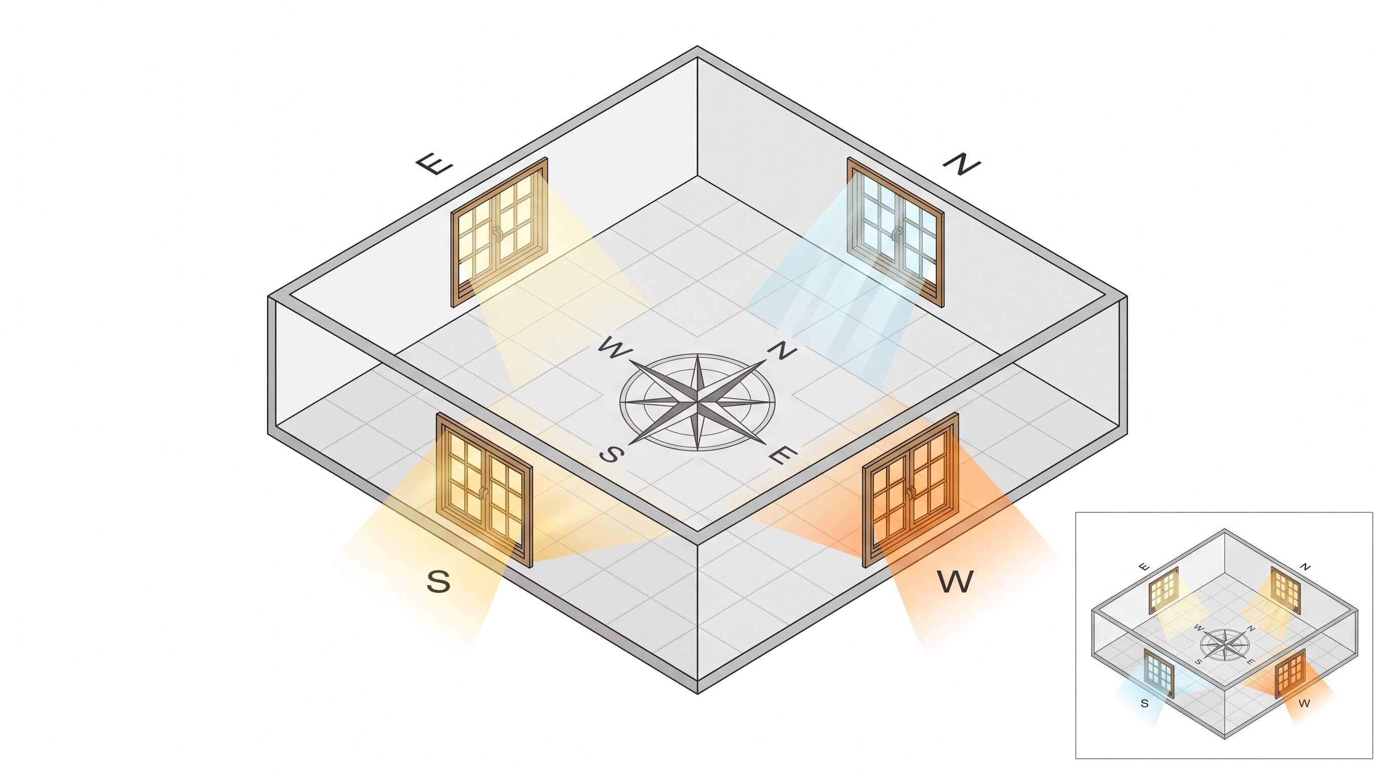
Window direction controls how warm and how strong the daylight is, so the same tin of paint can read grey-blue in one room and creamy in another. Find the direction by standing at the largest window and pointing your phone's compass out of it.
The table below is for the northern hemisphere (UK, Europe, US, Canada):
Window faces
Daylight
What happens to paint
What tends to work
North
Cool, soft and indirect all day
Cool colours look colder and mid-tone greys can look muddy
Warm whites and warm neutrals with an LRV of 60 or more
South
Warm and bright, strongest at midday
Colours look lighter and warmer, and pale shades can wash out
Cooler colours, deeper shades and most whites
East
Warm and bright in the morning, cooler after midday
The colour shifts a lot through the day
Choose for the hours you use the room most
West
Dim in the morning, golden in the late afternoon
Warm colours can turn orange near sunset
Soft neutrals, or warm colours if the room is used mainly in the evening
Sherwin-Williams' guide to choosing colour by room orientation also notes that north-facing rooms get the least light in the day and recommends colours with a higher LRV for them.
South of the equator, the sun sits in the northern part of the sky. In Australia, New Zealand and South Africa, north-facing rooms get the warm, bright light and south-facing rooms get the cool, flat light. Most guides are written for US and UK readers and leave this out, so swap the North and South rows if you live in the southern hemisphere.
A room with windows on two sides takes its character from the larger window. If the windows are similar in size, judge the room by the light at the hours you spend in it.
3. Check your light bulbs before judging any colour
After dark, your bulbs are the only light in the room, so they change paint colour as much as window direction does. Bulb colour is measured as colour temperature in Kelvin (K), where a lower number means warmer, yellower light and a higher number means cooler, bluer light.
Bulb
Label on the box
Effect on wall colour
2700K
Warm white
Warms every colour, flatters creams and warm neutrals, can make cool greys look dull
3000K
Soft white
Slightly warm, a safe middle for most living spaces
4000K
Neutral or cool white
Closer to how colours look on the chip in a bright shop
5000K and above
Daylight
Cools and sharpens colours, can make warm whites look grey
Keep every bulb in one room at the same Kelvin rating. A 2700K lamp next to a 5000K ceiling light makes one wall look like two colours. Bulbs with a colour rendering index (CRI) of 90 or above show colours closer to how they look in daylight. CRI is a 0 to 100 score for how accurately a light source shows colours.
If a bedroom is used mostly at night, the bulb matters more than the window. Test samples with the lights on at the time you would normally be in the room.
4. Use LRV to control how light or dark the room feels
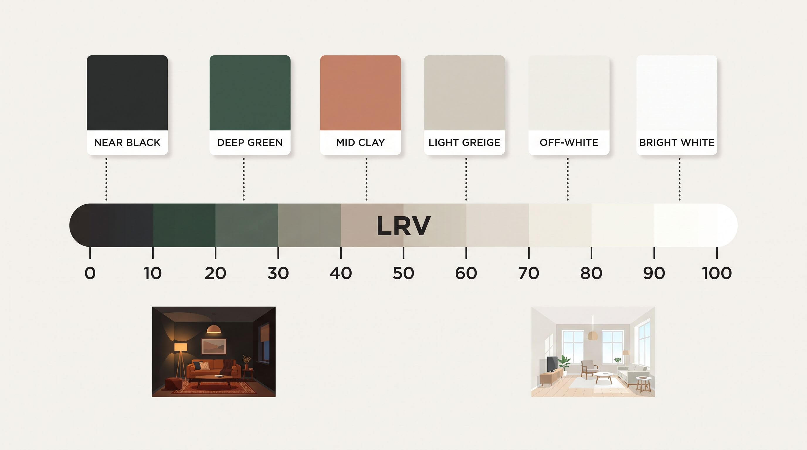
Light reflectance value (LRV) is the percentage of visible light a paint colour reflects, on a scale from 0 (black) to 100 (white). Most brands print it on the back of the chip or on the colour's web page, and no real paint reaches either end. Sherwin-Williams High Reflective White, for example, has an LRV of 93 and Tricorn Black has an LRV of 3.
These are the working bands we use when planning a room:
LRV
What it looks like
Where it fits
70 and above
Whites and off-whites
Dark rooms, small rooms, ceilings, rooms with one small window
50 to 69
Light neutrals and soft pastels
Most living rooms and bedrooms with reasonable daylight
25 to 49
Mid-tones
Bright rooms, feature walls, kitchen cabinets
Below 25
Deep colours
Snugs, studies, dining rooms and colour-drenched rooms meant to feel enclosed
Mid-tones in dim rooms are the riskiest choice, because they lose clarity without becoming cosy. For a north-facing room or one with a small window, keep the main walls at LRV 60 or above. If you want a dark room, commit and go below 20.
A colour also looks stronger on a whole wall than on a 5 cm chip. When you are torn between two neighbouring shades on the same strip, the lighter one is usually closer to what you pictured.
5. How do you find a paint colour's undertone?
Undertones only show up by comparison, so never judge a chip on its own. Use this sequence:
Put the chip on a sheet of plain white printer paper. Any lean towards pink, yellow, green or blue becomes easier to see.
Line it up with two or three colours from the same family, such as three beiges. The differences between them show each one's undertone.
Look at the darkest colour on the same strip. The deepest shade makes the undertone of the whole strip obvious.
Hold the chip against the floor, sofa and tile samples from the first step.
Common pairings to watch for: beiges lean pink, yellow or green, greys lean blue, green or violet, and whites lean yellow, pink, blue or grey. Greige, a mix of grey and beige, often leans green or violet.
6. Set the mood, and know what colour psychology can promise
Before you look at colours, describe in one or two words how the room should feel, such as calm, bright, cosy or focused. That word rules out half the fan deck straight away.
Blues and greens are traditionally linked with calm, and reds, oranges and yellows with warmth and energy. Research on colour and mood is less settled than paint marketing suggests, and how light or saturated a colour is often matters more than the hue. Treat the associations as conventions, and trust how a sample feels in your own room.
As a starting point by room:
Bedrooms suit soft, low-saturation colours that look good under warm bulbs. Our bedroom design ideas show complete schemes.
Living rooms can take more colour because they are used across the whole day.
Kitchens benefit from lighter walls when cabinets or a splashback already carry colour.
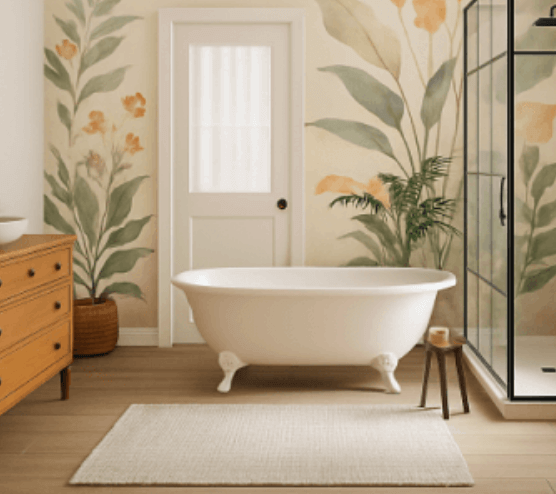
Bathrooms are often small with little daylight, so high-LRV colours and a moisture-resistant finish work best.
Home offices need colours that still look good at 4000K, the cooler light many people prefer for working.
7. Plan the whole room with the 60-30-10 rule
The 60-30-10 rule splits a room's colour into 60% for the dominant colour, 30% for a secondary colour and 10% for accents. In practice the walls are usually the 60%, upholstery, curtains, rugs and cabinetry make up the 30%, and cushions, art and lamps carry the 10%.
The rule lines up with real room geometry. In a 3.6 m × 3.2 m room with a 2.4 m ceiling, the walls come to about 29.6 m² after taking out one window and a door. The floor and ceiling are 11.5 m² each. That puts the walls at roughly 56% of the room's surfaces, so the wall colour will dominate whether you plan it or not.
The ceiling is the surface people forget. At about 22% of the surfaces in that room, it is as large as the floor. A white ceiling makes walls look taller, while painting it the same colour as the walls (often called colour drenching) blurs the edges and makes a room feel enclosed.
Choose the finish, ceiling and trim at the same time
Finish, also called sheen, changes how dark a colour looks and how well the wall cleans, so pick it alongside the colour.
Finish
Look
Best for
Effect on colour
Flat or matt
No shine
Ceilings, bedrooms, living rooms
Softest colour, hides dents and patches
Eggshell
Low sheen
Living areas and hallways
Close to the chip, wipes clean better than matt
Satin
Soft sheen
Kitchens, bathrooms, children's rooms
Slightly richer colour, shows more wall flaws
Semi-gloss and gloss
Shiny
Trim, doors, cabinets
Colours can look darker than the swatch
For trim and ceilings, one white used throughout the home keeps the rooms connected. If the walls are a warm colour, choose a warm white for the trim so it doesn't look blue beside them. Painting trim the same colour as the walls in a higher sheen is a quieter option that suits small rooms.
Preview the room in 3D before you buy sample pots
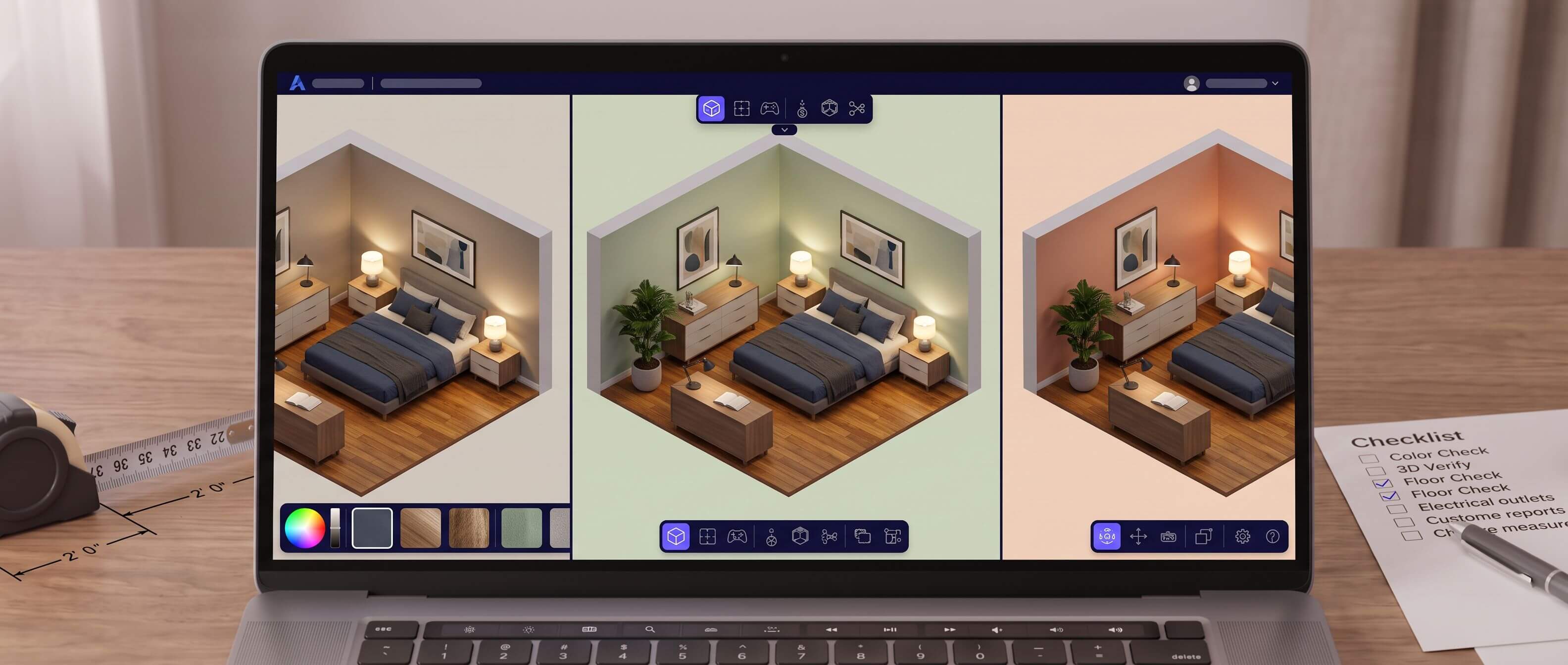
A 3D model shows a whole scheme at the right proportions, with walls, trim, ceiling, floor and sofa together, which a paint chip can't do. Use it to cut a shortlist of five colours down to two or three, then buy samples for those. We have market best free 3d room design planner, the process looks like this:
Enter the room's dimensions and add the windows and doors in their real positions.
Add flooring and furniture close to what you own. The library includes hardwood, tile and carpet floors.
Apply each shortlisted wall colour and save each version so you can compare them side by side.
Switch the lighting between day and night to see how each scheme holds up.
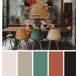
To match a rug, fabric or artwork, upload a photo of it to the free colour palette generator, which gives HEX, RGB and HSL codes for each colour you pick.
For a client or a partner who struggles with 3D views, turn the room into a photorealistic image with AI interior design renders.
Screens have a limit you should plan around. A monitor emits light while paint reflects it, and two screens rarely show the same colour. Use the 3D preview to judge proportion, contrast and how colours sit together, and make the final call from a painted sample on the real wall.
Digital previews are becoming a normal part of painting.
How to test paint samples so they don't mislead you
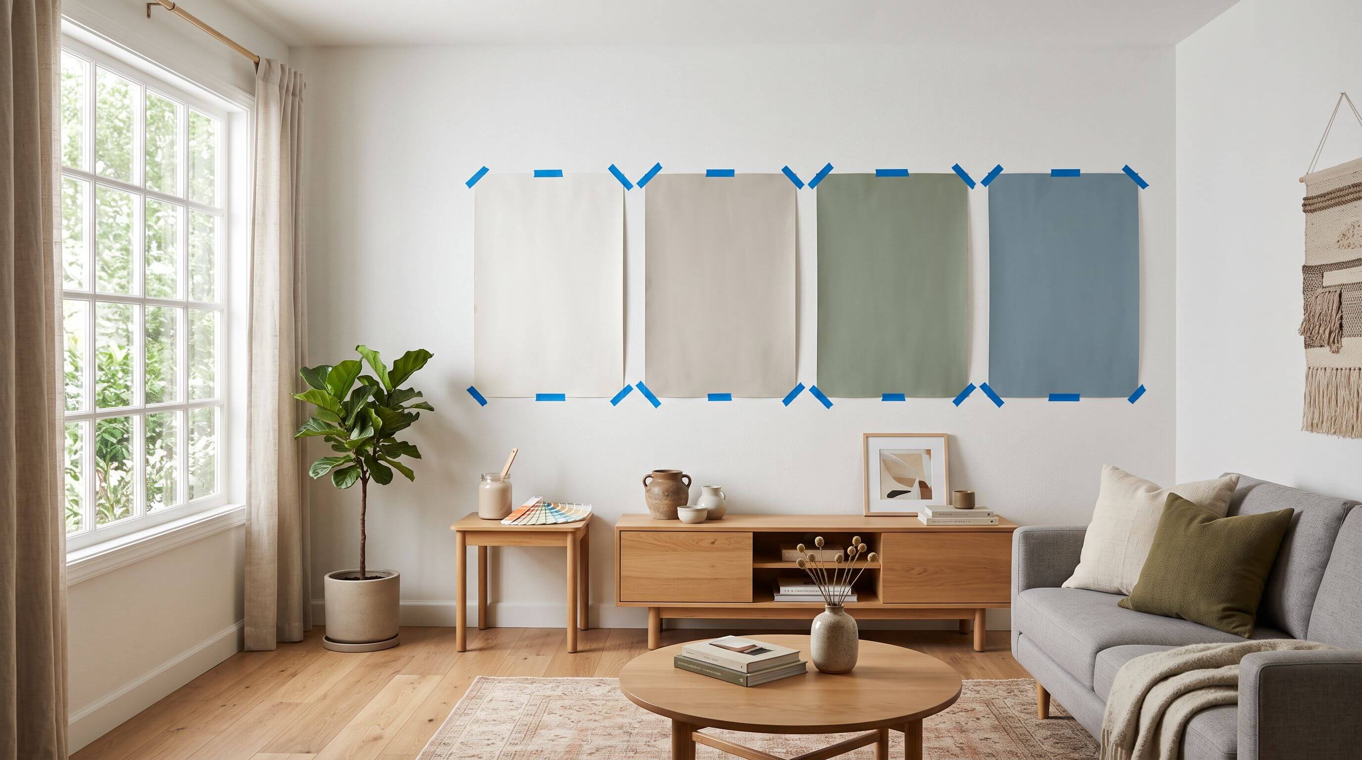
Test on movable boards, two coats thick, in the actual room for at least two days. A small patch brushed straight onto the old wall is tinted by the colour around it and stuck in one spot.
Buy samples for two or three colours. More than that makes the comparison harder.
Paint each colour on white card or lining paper of at least A3 size (297 × 420 mm), with two coats.
Trim off any unpainted white border, which makes the colour look darker by comparison.
Let the boards dry fully for a day. Wet paint is a different colour from dry paint.
Tape each board to the brightest wall, the wall opposite the window, and beside the trim near the floor.
Check them in the morning, at midday and after dark with your usual bulbs on, over two days.
Look from where you sit or lie in the room, two to three metres away, and remove one board at a time until one is left.
Frequently asked questions
Does paint look different wet and dry?
Yes. Many water-based paints look lighter when wet and settle slightly darker as they dry, and the sheen changes too. Judge a sample only after it has dried for at least a day. A second coat also changes the result, because one coat lets the old colour show through. Compare samples painted with the same number of coats, ideally two, to keep the test fair.
How many colours should one room have?
Most rooms work with one wall colour, one colour for trim and ceiling, and accents in the furnishings. Two wall colours suit rooms with a clear zone, such as a reading nook or a wall behind a bed. Once you go past that, the room tends to look busy unless the colours share an undertone or come from the same paint strip.
Can you use one paint colour for the whole house?
Yes, and it suits smaller homes and open-plan layouts well. One colour still looks different in every room because of window direction and bulbs. A colour that is perfect in a south-facing living room may look grey in a north-facing hall. Test it in the darkest room first, or use the same colour at different strengths from one strip.
Can you choose a paint colour from a photo?
You can pull the colours from a photo of a rug, fabric or room you like, and a palette tool will give you the codes. Treat those codes as a starting point. Phone cameras adjust colour automatically, so take the codes to a paint shop, find the nearest physical chips and test them as samples in your room before buying.


 Color palette generator
 3D design from AI chat
 Floor plan creator
 Kitchen design tool
 House design software
 Landscape design software
 Bedroom design
 Office floor plan creator
 Trade show booth design
 How to use Arcadium — full guide
 Community Showcase
 3D object library - free
 Articles and blog